Menu
Challenger
Education
An e-commerce, event booking, and news app aimed at increasing Challenger’s market share among students and educators.
The Goal
When Challenger Technologies Limited set out to expand into the student and education sector, they envisioned an app that would serve as a hub for exclusive tech products tailored to students and educators.
They have been in the tech retail and e-commerce industry for decades now, and laid out a blueprint built on the successes of their current platforms. The goal was clear: create an engaging e-commerce platform to drive sales and foster customer loyalty.
The Process
1
User Research
Understand user needs through research and analysis.
2
Define the Problem
Establish the main problem to solve with the design
3
Ideation
Generate and brainstorm potential solutions.
4
Prototyping & Testing
Create mockups and validate designs with user feedback and improvements.
5
Implementation
Develop and launch the final product design.
User Research
I began by analysing popular e-commerce apps like Lazada and Shopee to understand what makes them successful. I also conducted usability tests with 4 participants on the mobile version of Challenger’s existing e-commerce website, as the app will be using the same infrastructure and content management system.
Key Findings include:


Define the Problem
How might we encourage users to not only make their first purchase, but also keep coming back?
Ideation
Armed with these insights, I focused on designing the e-commerce flow to be user-friendly and engaging.
I designed the product page to prominently display the product image, name, price, and an always-visible “Add to Cart” button.
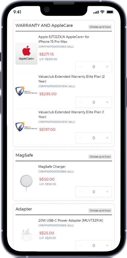
Large, tappable image buttons for each variant, allowing users to see differences at a glance and compare options side by side.
Upon pressing the “i” button in the previous screen for the ValueClub Extended Warranty (VEW), users can see essential extended warranty information.

Prototyping & Testing
I conducted usability tests again with the same 4 users on the new design using a Figma prototype., and their sentiments were:
4/4 users found it straightforward to learn about and purchase products.
4/4 users found the larger variant options allowed them to more easily compare the products and make confident decisions.
3/4 users felt that the warranty information was more clearly displayed and provided additional assurance during the purchase process.


