01 — Overview
Students needed more than a smaller version of Challenger's retail app.
Challenger wanted to grow its presence in the education sector with a mobile product tailored to students and schools, separate from its main retail platform.
The opportunity was to combine exclusive student pricing, workshops and useful tech content without creating an experience that felt cluttered, transactional or difficult to navigate.
My role
As lead designer, I shaped the product experience and branding, balancing student needs, commercial goals and engineering constraints across shopping, events, content and rewards.
02 — The challenge
Commerce, learning and loyalty needed to work together without overwhelming students.
The app had to support several distinct jobs: help students find affordable technology, make purchases confidently, discover useful workshops and keep returning between transactions.
Problem statement
How might we combine student shopping, learning and rewards in one mobile experience while keeping each journey simple and relevant?
Many needs
Shopping, event registration and content discovery had to coexist in one product.
Young audience
The interface needed to feel familiar, lightweight and approachable for students.
Beyond purchase
The experience needed to create value even when students were not buying.
03 — Product strategy
The experience was organised around three clear reasons for students to engage.
Rather than treating commerce, education and rewards as competing features, the product connected them through student goals: save on technology, learn something useful and earn value over time.
What the product needed to achieve
- 1
Make student pricing easy to access. Exclusive products and offers needed a familiar shopping journey with minimal friction.
- 2
Give students a reason to return. Workshops and practical tech content needed to provide value beyond a purchase.
- 3
Connect activity to rewards. Purchases, event attendance and referrals needed to reinforce a single, understandable membership experience.
04 — From strategy to solution
Each core journey was designed around a specific student need.
The information architecture separated shopping, learning and account management while using points and rewards to connect them into one coherent experience.
Student need
Students needed access to exclusive education pricing without a complicated buying process.
Design decision
Use familiar e-commerce patterns and simplify checkout into clear, progressive steps.
What changed
Students could browse products, choose delivery details and review their purchase confidently.
Student need
A product catalogue alone would give students little reason to return between purchases.
Design decision
Bring workshops, practical tech content and rewards into the same student experience.
What changed
The app supported learning and regular engagement alongside commerce.
Student need
Shopping, events, points and account management could become overwhelming when treated as separate systems.
Design decision
Organise the product around distinct student goals, with a central profile connecting progress and rewards.
What changed
Students could understand what to do next while keeping their activity and benefits in one place.
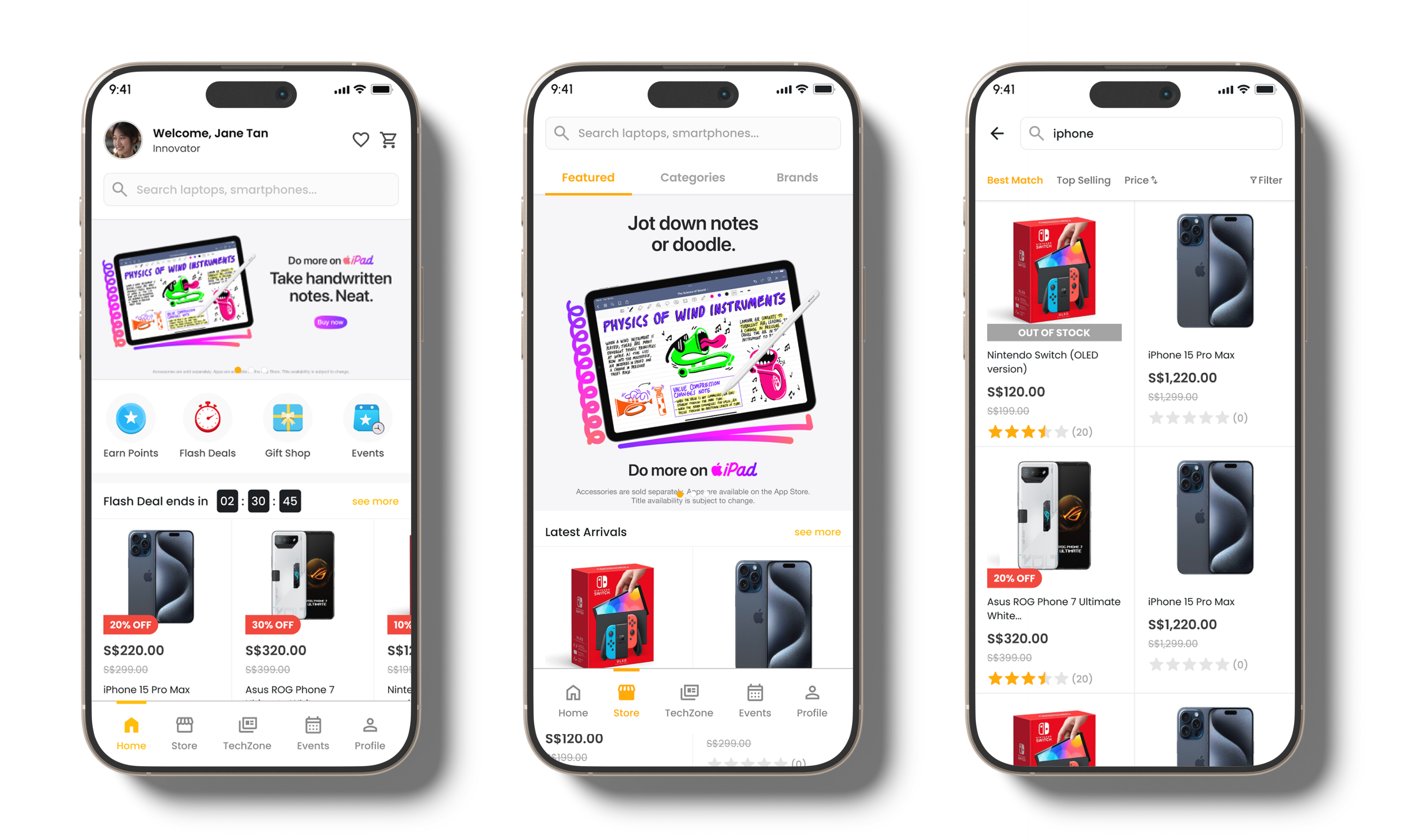
Key features across the experience
Education pricing
Students could discover exclusive prices on relevant devices and tech products.
Simplified checkout
Payment, delivery and order review were presented as clear, familiar steps.
Events & workshops
Students could explore free events and register directly in the app.
TechZone
Curated articles, product reviews and practical tips encouraged ongoing discovery.
Points & rewards
Purchases and event attendance contributed to rewards, gifts and discounts.
Profile & referrals
Membership progress, event history, support and Refer & Earn lived together.
05 — The experience
Four connected journeys made the platform useful beyond a single transaction.
The experience balanced immediate shopping needs with practical learning and longer-term loyalty, giving students several clear ways to engage with the platform.
Browse products and complete checkout
Student pricingDiscover and register for workshops
In-app bookingRead articles and explore tech tips
TechZoneTrack points, rewards and referrals
Central profile06 — Impact
The platform attracted students and generated measurable results within 30 days.
The launch demonstrated demand for a dedicated student platform that combined education pricing with workshops, practical content and rewards.
1,525
New user sign-ups in the first 30 days after launch.
$14,200
Total sales generated during the first 30 days.
83
Workshop registrations during the same launch period.